Overview
Once the DMARC Analyzer is fully configured, Trustifi begins collecting DMARC aggregate reports from email receivers and displays them in a centralized dashboard. This section explains how to interpret the DMARC Analyzer dashboard, including email volume trends, sender compliance, authentication outcomes, sending source analysis, and identification of spoofed attack recipients.
Accessing the DMARC Reports Dashboard
After DMARC Analyzer setup is complete, navigate to the “DMARC Analyzer” page (Domain Protections > SMARC Analyzer). The dashboard displays collected DMARC report data for your domain.
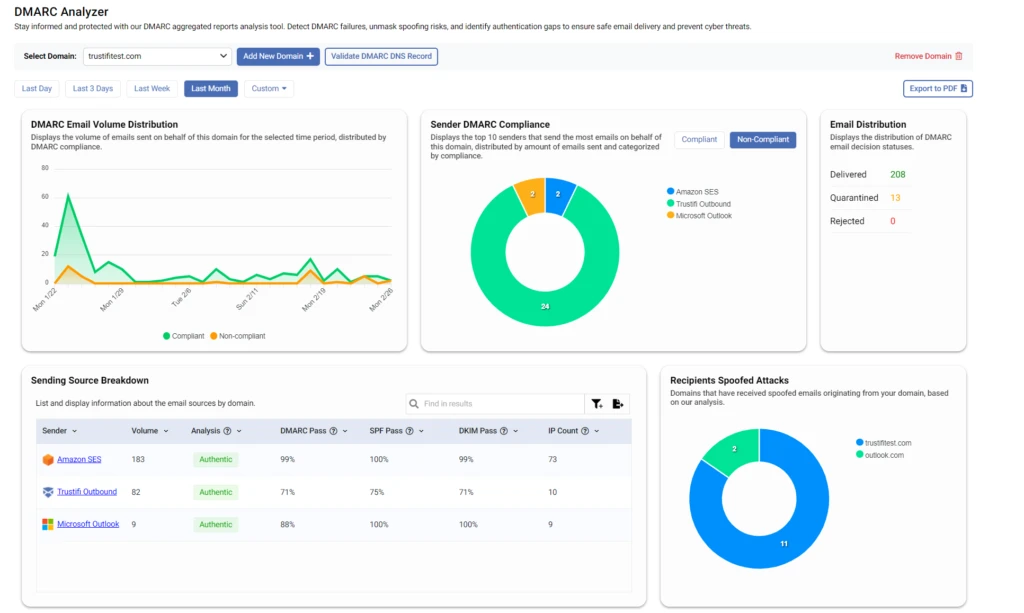
This dashboard is divided into multiple reporting widgets, each visualizing a different aspect of DMARC and email authentication performance.
DMARC Email Volume Distribution
The “DMARC Email Volume Distribution” chart displays the volume of emails sent from your domain over a selected time period, categorized by DMARC compliance.
The green line in this example represents emails that comply with your DMARC policy.
The orange line in this example represents emails that do not comply with your DMARC policy.
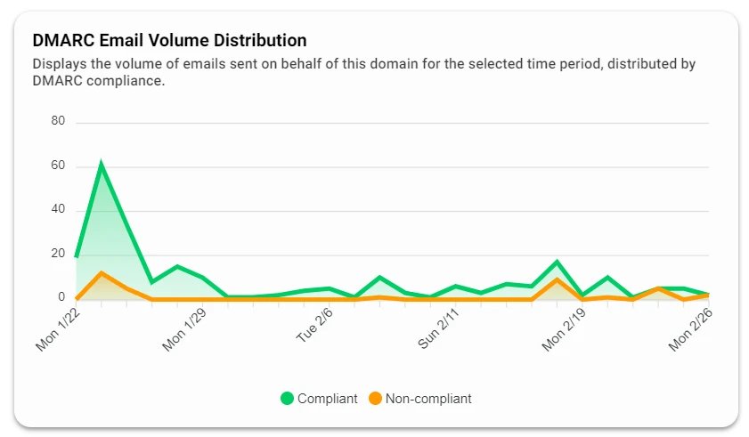
This view helps identify trends or sudden changes in DMARC compliance. For example, an increase in non-compliant emails may indicate domain spoofing activity or a recent DNS misconfiguration affecting SPF or DKIM.
Hovering over individual data points in the chart displays the exact number of compliant and non-compliant emails for that day or week.
Sender DMARC Compliance
The “Sender DMARC Compliance” widget displays a donut chart showing the top ten sending entities (by volume) that send emails on behalf of your domain.
Two selectable views are available:
“Compliant”
“Non-Compliant”
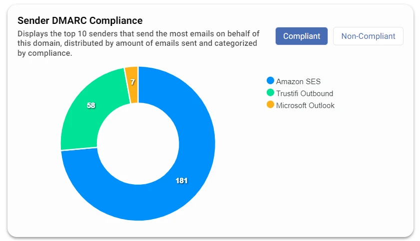
“Senders” in this chart may represent internal mail servers, third-party services, or external platforms authorized to send email on behalf of your organization.
This chart helps identify which sending sources are properly authenticated and which may be misconfigured or suspicious.
Email Distribution
The “Email Distribution” panel displays the overall distribution of final DMARC disposition results for emails sent from your domain during the selected period.
The disposition values include:
Delivered — Emails that passed authentication or were permitted by policy.
Quarantined — Emails that failed authentication and were moved to spam or quarantine based on policy.
Rejected — Emails that failed authentication and were blocked outright.
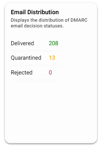
In a healthy email environment, few or no emails should appear as quarantined or rejected. A high volume of rejected or quarantined emails may indicate spoofing attempts or SPF/DKIM misconfiguration.
Sending Source Breakdown
The “Sending Source Breakdown” table lists every entity that sends emails on behalf of your domain and provides authentication performance statistics for each.
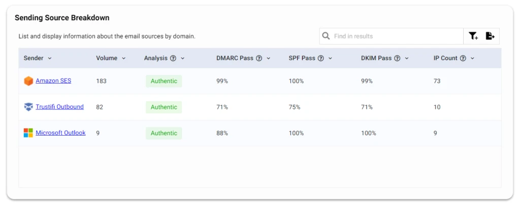
For each sending source, the table displays:
Volume — Total number of emails sent from this source.
DMARC, SPF, and DKIM pass rates — Percentage of emails passing each authentication check.
Analysis — Trustifi’s classification of the source as “Authentic,” potentially spoofed, or another category such as auto-forward or redirect service.
IP count — Number of unique IP addresses observed sending mail from this source.
This table helps administrators verify legitimate sending services and detect unauthorized or misconfigured sources.
Records for Each Sending Source
Clicking any sending source in the breakdown table opens a detailed record list of all emails reported for that source during the selected period.
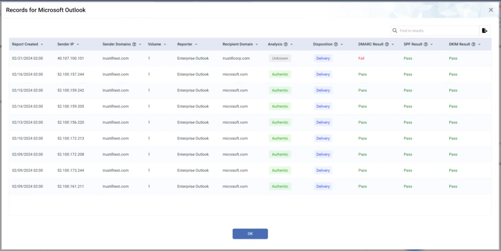
Each record displays:
DMARC result for the message
SPF result
DKIM result
Delivery disposition (Delivered, Quarantined, or Rejected)
Sender metadata and timestamp details
These records help IT teams diagnose DNS misconfigurations affecting MTAs or external email services and identify suspicious behavior that may indicate spoofing.
Recipients of Spoofed Attacks
The “Recipients of Spoofed Attacks” widget displays a donut chart showing domains that reported receiving emails appearing to spoof your domain.
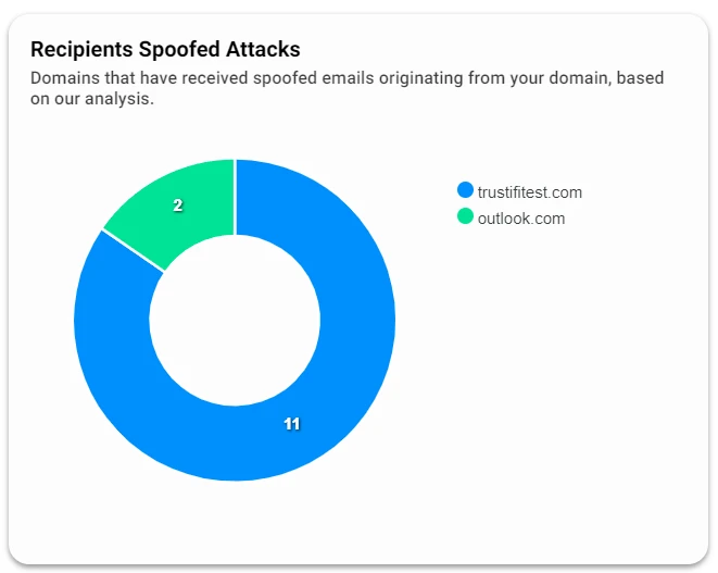
Ideally, this chart should contain no data. If populated, it visualizes which external domains are receiving spoofed emails originating from your domain identity, helping assess the scope of spoofing activity.
Notes
DMARC reporting data updates continuously as new aggregate reports are received. Sudden changes in compliance or disposition trends often indicate DNS authentication misconfigurations or emerging spoofing attacks. Regular monitoring of these charts and tables is recommended to maintain strong domain email security.